How To Select The Perfect PowerPoint Image
Many presenters understand that it’s a bad idea to clutter their PowerPoint slides with dozens of words, numerous bullets, and a handful of sub-bullets. They know that it’s better to use a compelling image, one that visually reinforces the point they’re making verbally.
Knowing that is a good start. But it’s not enough.
In this post, you will see the evolution of a single idea over four slides, which will help you learn an easy way to identify the right images for your next presentation.
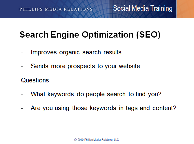
1. The Text and Bullets Slide (Ineffective)
This is the most common type of text slide: A big headline followed by a few bullets. The problem? Those words aren’t “sticky” and will probably be forgotten by the audience before you finish your talk.
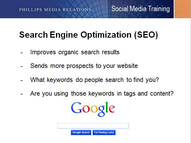
2. The “Enhanced” Text and Bullets Slide (Ineffective)
Some speakers think they can improve the slide by adding a related image (in this case, the Google search bar). But that image does little to help audience members remember the key points you want to make about SEO.
3. The Overly Literal Image Slide (Not Particularly Effective)
The good news here is that speakers are thinking visually. But their images are too literal and don’t help audiences remember their key points. When I ask speakers what visual might represent a key point they want to make, they often look at the text slide, pull out a key word, and center their visual around that word.
In this case, they might focus on the word “organic” and put up an image of vegetables. Or they might look at “keywords” and put up an image of a keychain. Or they might look at “prospects” and select an image of a person interviewing for a job. Or, as in the below slide, they might focus on the word “search” and make that the centerpiece of their visual.
This is a step in the right direction, but it still doesn’t quite do the trick. The slide simply isn’t memorable; nor does it evoke a specific idea.

4. The Conceptual Slide (Effective)
To get people to stop thinking literally, I tell them to forget about the slides altogether and ask them to just tell me, without notes, what they want people to know about each point. This is the type of answer I typically hear:
“Well, I want people to know that SEO is a really important tool to help entrepreneurs find customers online. I’ve seen so many good businesses go belly up because they didn’t know how to target their customers. But if you have good SEO and people can find you easily, you’ll have customers streaming into your business through your website.”
Now we’re getting somewhere. By listening carefully, I identified a few potential concepts. I could play with the idea of customers “streaming in” through a door. Or banging down your door. Or, as you’ll see in the example below, I focused on the more cautionary tale of what happens to a business that fails to prioritize SEO.

Use the same process when trying to match the right idea to the right visual. First, talk about the points you want to make about a specific topic out loud. Don’t overthink it. Let the words and phrases flow. Pay careful attention to any interesting words or phrases you use, which could become the slide’s central image. (Better yet, have somebody else listen to you as you practice so they can capture your words for you while you speak.)
Finally, remember the most important point: Ditch literal thinking, and embrace conceptual thinking instead.
My new book, 101 Ways to Open a Speech, is now available at Amazon. You can read more about the book here.
Share this article
- Share on Facebook
- Share on Twitter
- Share on LinkedIn
- Share on Email


Brad, This is great content. I like the concept of transitioning away from predictable, literal images.
Do you have any tips for doing the same thing with very text-dense slides? I’m tasked with adding style to a very detailed, text-heavy presentation about estate and tax regulations. How can I apply your strategy to a slideshow that (by necessity) is full of very specific detail and lacks a single central message?
Thanks for the great information. I’m glad to have stumbled upon your website.
Hi Michael,
Thank you for your comment; I’m delighted that the content was useful for you.
I’m planning to write more on the topic you mentioned soon — it comes up often in our trainings. Feel free to email me a sample or two of the slides you’re talking about, and I might be able to offer a few specific ideas.
A few things come to mind right away:
1. If there are three main thoughts on the slide, separate them into three different slides.
2. Make sure the headline isn’t something generic such as, “2018 Q1 Forecast,” but rather something that says something meaningful, such as “2018 Q1 Forecast: Slowing Growth.”
3. Ask yourself whether you can have two decks: one for visual display (simpler) and another for a takeaway document (more complex).
More on this subject to come!
Best,
Brad