Top 5 PowerPoint Mistakes & How to Avoid Them
You’ve surely sat through at least one, probably several, awful PowerPoint presentations during your life.
Perhaps you saw a speaker fly through 100 word-filled PowerPoint slides in 20 minutes. Maybe you had to listen to a speaker reading each slide to you verbatim. Or, perhaps you had to strain to see the cluttered slides, each filled with microscopic text.
PowerPoint mistakes can be a common problem for presentations large and small. Maybe you’re even guilty of committing some PowerPoint sins yourself.
Some of these unfortunate events might be symptoms of deeper problems – failing to identify, refine, or narrow in on your key message, not having (or not giving yourself) enough time to put together a memorable slide show, or forgetting that you are not a walking Wikipedia page.
For instance, have you ever seen a slide like the one below? It certainly gave lots of information to the U.S. commanders in Afghanistan, for whom it was prepared. But, it also is an apt example of why some people think PowerPoint is awful.

But PowerPoint is just a tool, which means it’s only as good as its users.
Used well, PowerPoint can be an enormously valuable tool, one that can help you communicate more effectively. An effective slide can make all the difference. The right visuals, displayed in the right way, can make your messages stickier and your key points more memorable. They can make your audiences feel deep emotion and drive people to action.
The following tips will keep your slides moving, your design compelling, and your content illuminating. We begin our Top 5 countdown with one of the more prevalent PowerPoint mistakes — loading up your deck with too many slides.
Mistake #1 – Too Many Slides
When you use too many slides, it’s easy to cause a case of collective information overload. Unless your slide truly helps your audience to better understand your main point, it probably hasn’t earned its spot in the deck.
It’s fine to parse through questions such as how many slides per minute, how many slides for an hour presentation, or how many minutes should I spend on each slide. However, when you are dealing with a visual medium, quality – not quantity – should rule your decisions. The most important question you must ask yourself is if a slide is absolutely necessary, and if it furthers your point in a way your words alone cannot.
As to your other questions, here are some answers that will keep you from making one of the more easily avoidable PowerPoint mistakes.
How Long Should Your PowerPoint Presentation Be?
What’s the magic number? Five, 17, 52, 76? How many slides should you have per deck? People want an easy answer, but it’s not that simple. Some presentations would be better with no slides at all, while some expert speakers can click through 120 simple slides in an hour.
Why the variation? Because this is not a PowerPoint presentation, but rather your presentation. Although some presenters must follow prescribed or institutionalized formats, the length of your talk typically is dependent on several unique factors, including the subject, the format, the intent (a training, a sales pitch, a fundraising appeal, or an educational lecture). Your visuals, including PowerPoint, are merely the tools you use to convey your message to your audience. You don’t say I have a “hammer” home improvement project. You have a home improvement project for which a hammer would be helpful.
How Many PowerPoint Slides Per Minute?
When we work with our clients in our public speaking classes and custom workshops, we often address the oft-cited “One Slide Per Minute” rule when it comes to their PowerPoint slides. A rule, of course, can be helpful in offering specific guidance and an easy guideline to follow when putting together your presentation. But, this not always a helpful rule.
Here’s why: The rule says nothing about how much information should appear on the slide. Presenters who pack 120 slides worth of information onto 60 slides for an hourlong presentation certainly follow the rule, but likely produce a cluttered mess. And, in all likelihood, no one wants to look at 60 packed slides in an hour. Your presentation is also about making a connection with your audience. That connection is established and re-established every time your audience turns their attention from your slides back to you.
A slower pace can help foster that connection, as well as allow your audience to better digest and process the information you are sharing.
How Many Slides for an Hour Presentation?
So, if you don’t go for 60 slides in 60 minutes, what is the proper “rule?”
It comes down to this question: “Do I absolutely need this slide?”
In other words, if delivering the information verbally would be as compelling, you don’t need it. Conversely, if the image is so visually arresting that it helps to make your message all the more memorable, then it’s earned its place.
Here’s an example: One client wanted to make a crucial point to his employees about increasing the cost of electronic storage for his firm. “This is how much data we’re storing today,” he said, as a giant black circle filled the screen. “Three years ago,” he continued, “this is how much we were storing.” As he delivered that line, he clicked again and an almost imperceptible white circle appeared in one corner, atop the giant black circle. The audience gasped.
He could have shared a clever analogy instead, but the audience’s reaction indicated that little would have been more effective than his two-part slide.
The proper number of slides per minute can best be answered like this: It should be the right amount to help you achieve your goals. That could be four or dozens.
How many minutes per slide?
The answer: As long as is necessary to make your point and as brief as possible to avoid losing your audience’s attention along the way. Say you head an international relief organization, and you want to convey the magnitude of a recent disaster and the individual cases of need. You might quickly click through dozens of images of devastated areas to show the massive degree of need and then settle for several minutes on a single image of just one family that is struggling to survive. Your slides help to personalize what might seem to be an overwhelming task.
Maybe, you want your audience to focus on a big-picture view, rather than dwell on minutia. So, you only show a half-dozen slides, with one or two words, writ large, that reflect your most important themes.
Mistake #2 – Too Little White Space
As presenters, we want to focus our audience’s attention on exactly the point we want them to focus on. But when speakers fill almost every centimeter of their slides with words, bullets, and graphics, they give the audience no sense of priority. Cluttered slides make it impossible for the audience to know where to look first.
Don’t fill every inch of the frame. White space — or “empty” space — is a critical component of guiding viewers to your most important point.
As Garr Reynolds writes in the excellent Presentation Zen Design, “White space is not nothing. It’s a powerful something.” Nancy Duarte echoes his point in her wonderful book slide:ology: “Whitespace is as much an element of a slide as titles, bullets, and diagrams.”
This slide, from one of our public speaking workshops, is a good example of a slide with plenty of white space.

Mistake #3 – Too Many Words
What is the goal of PowerPoint? The main goal — as with all communication — is to transfer information, knowledge, or inspiration from you to your audience.
Words on a screen can do those things, but not nearly as well as an inspired presenter who uses simple graphics and visuals to reinforce the most important points.
As an example, here’s an ordinary slide about the importance of Search Engine Optimization (SEO):

That slide isn’t terrible, but it’s not likely to reach the audience on an emotional level. The point of the slide is this: If you’re not visible when your audience is searching for you, it’s as if you don’t exist. Here’s a more conceptual slide that strips out everything that isn’t absolutely essential to the key point:

A great image teamed with a simple message is remembered far longer than a list of a half-dozen bullet points.
Mistake #4 – Slides Double as a Handout
Many presenters print their PowerPoint presentations and distribute them to the audience as a takeaway document. Because the presenters know their slides won’t make sense without explanation, they add a lot of text to make sure their slides can be understood months or years after their presentation.
The problem with that approach is that speakers end up developing what Nancy Duarte calls a “slideument” — a slide that is half written document and half presentation visual. Slideuments fail in both roles; they lack the detail required by a written document but are too cluttered to serve as an effective visual.
Slides are not meant for double duty. The best solution is to separate the two. For your presentation, design clear, concise, and captivating visuals that grab the audience’s attention and demand your explanation during the presentation. Separately, create a detailed document that people can take away from the presentation once you’ve finished speaking. There are exceptions, but handouts that are dense with material rarely make for gripping visuals.
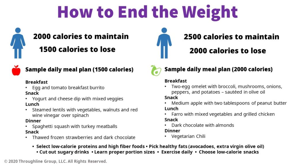
For instance, say you are a nutritionist who is talking to an audience looking for tips to lose weight. The following slide would certainly be helpful as a take-home guide, but probably a bit much to take in during the presentation itself.
Mistake #5 – The Slides Are For The Speaker
Among the top PowerPoint mistakes, this is one that many presenters have been guilty of at one point or another. Many of our trainees confess to using slides as their personal speaking notes. “Without the slides,” they protest, “how am I supposed to know what to say next?”
If you see your slides as sticky notes for your presentation, your audience likely will, too. Slides are intended to help the audience remember your information — not to help you remember your own information.
Instead of using your slides as your speaking notes, print out your notes on paper or notecards. Place your notes on a small table set slightly to one side. When you forget what to say next, simply look down (while not speaking and remaining calm), look back up, establish eye contact, and resume speaking.
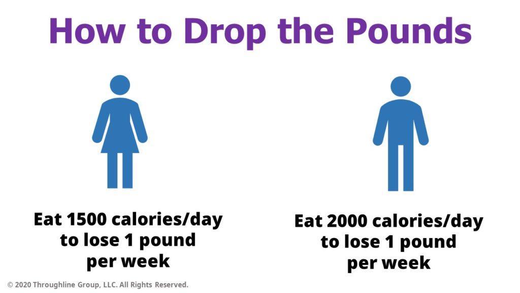
Returning to the nutritionist, instead of slides full of bullets, and low-cal menus, he might want to focus on key messages, such as the importance of shaving off 500 calories each day and making better food choices. The fewer words, the better, as these examples show:
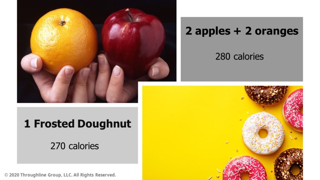
In the following slide, he focuses on just one example of how to make the most out of your daily caloric intake. It is far more likely this slide will help the audience better understand the point he is trying to make about better food choices than the text heavy meal plan slide.
Get Help With Your PowerPoint Presentation
We’ve provided tips on how to counter the top five PowerPoint mistakes that are often encountered. Before we leave you, here’s one last element to consider: Your material is the star of the show. When you concentrate on creating clear, clean, and concise design – teamed with your words providing context – you help an audience focus on what it is you want them to see and understand.
Here are two final tips:
1. Know your color wheel. Carefully consider the colors you choose, as some combinations can be hard to read, whether you are colorblind or not. Some pairings can be hard on the eyes, such as red letters on a blue background or green on red. You can find professionally curated color schemes in the PowerPoint “themes” feature, as well as online resources – some free – that can guide your complementary color choices.
2. Keep it simple. Just because PowerPoint comes with special design effects doesn’t mean you have to use them. Transition and animation elements can quickly overwhelm the content. You don’t want your audience distracted by the method of how they are receiving the information. Make sure transitions and animations are tied to the narrative, such as a left-to-right movement to portray the passage of time.
When your PowerPoint strategy is focused on providing your audience with the most visually compelling images at a pace that most effectively conveys your key points, PowerPoint lives up to its name. When you learn how to avoid common PowerPoint mistakes, you wield a powerful tool that makes your messages sticker and your presentation far more memorable.
Share this article
- Share on Facebook
- Share on Twitter
- Share on LinkedIn
- Share on Email


Thank you for the post – I think your are absolutly right about your points. Often when I attent meeting in my network then people are often just use a PowerPoint slideshow with a lot of text and no images. That is so boring to watch 🙂
I hate, despise, loathe PowerPoint slideshows with a passion! Entertain me with your wit, your stories painted with glorious vocabulary, your humor…but please, don’t show anymore PowerPoint slides! Let me use my own imagination.
I’ve worked for years as a speech writer in politics and at a university. Some PP conclusions:
1. Usually PP means speaker will turn off the lights…a portion of the audience will likely nod off, or at least want to. Seen it happen.
2. A few charts for the data driven are very helpful and PP is a good way to offer them, along with some duplicates as handouts as the audience is exiting.
3. PP is NOT a safety net for the speaker but most who use it hang off it with such dependence that it sucks the life out of the remarks.
4. Although he’s an academic and a bit overwhelming, Edward Tufte is an expert at the corrupting effect of PowerPoint. You can glimpse his point of view on his web site:
http://www.edwardtufte.com/tufte/books_pp
5. Imagine if Barack Obama or Marco Rubio used PP and weep.
Jill,
Great feedback! Thank you for leaving the comment on the blog — I hadn’t thought to include your point about PPT meaning the lights are turned down, but you’re exactly right.
To good speeches and great (e.g. short and minimalistic) PowerPoints.
Brad
Most people don’t know they can press ‘.’ (dot) in Powerpoint to produce a black screen, and ‘,’ (comma) to get a white screen. Then press any key to get on with your presentation (exactly where it was).
I _always_ use one of these (whichever color better fits my template and the surroundings) to turn off the image when I want people to look at me.
I think leaving the last slide there, after it has been read by the audience, when you want to explain further, isn’t enough. It is still distracting. The more emphasis and emotion you put on a point, the more people will tend to avert your eye contact, out of shyness – and a projected image right next to you is an irresistible temptation… it’s better not to give them any.
Another neat way to use this feature is save it only for your main point. Give people 20 minutes of slides, and then, when the moment comes, bam! black screen, slow down your voice, look someone in the eye and say “look, there’s one thing I really want you to think about today…” – tremendous effect!
Pedro
When there is a PowerPoint presentation in the offing, part of me wants to be caught up in the visual underlining of what the speaker is saying. What happens each and every time is visual text only, handouts and the eventual recycling bin with no staying power to any of the information.
I’m starting a new business and will be presenting, but without PowerPoint. I hope to engage everyone with splashes of color in props and handouts along with energy/information, leaving my target audience satisfied and interested in my services.
Pedro — “B” and “W” do the same thing (mnemonically easier to remember, at least for me).
If you’ve had a really terrible experience with the audience — and who hasn’t, at least once? — you can just wail on these keys like you’re playing the world’s fastest rendition of “Heart and Soul”, probably causing more than one seizure in the process.
I’m sorry, I do so many presentations with different content that I’m guilty of using PP Slides as notes for myself and the audience afterwards.
What I have started to do with the content I’ve taken over, though, is replacing slides with pictures, or glossing over slide content (it’s for future use after I’ve long gone) and go to a picture to make the point that the previous wordy slide detailed.
Far from perfect, but moving in the right direction.
And thanks for the ‘B’ ‘.’ and ‘W’ ‘,’ hints; I must look for more!
Great solid advice and I agree. I have found that audiences will comment on evaluation when no PPT is used with a negative comment “no visuals”. I feel that to off set that, provide them with a 1 page “take away” document written by you or someone else that compliments what was shared verbally. I personally feel better and more comfortable with a presentation if I simply talking. I may have a note with bullets of the flow/points I want to be sure and cover as a prop for me. Just did this recently to an audience of about 50 and at the end of my presentation, we had great dialogue. So refreshing.
Treating presentations as a one-way ‘lecture’ is often the problem. Presenters who interact with their audience are always more engaging. This could be just soliciting questions from audience members or something more interactive such as using a PowerPoint polling tool like http://www.participoll.com
After many years working with PowerPoint and witnessing presentations I could see, bad, average and good presentations. Unfortunately the bad and average presentations are the predominant but this can be coached and the tips you shared in this post are good reminders for any presenter who is trying to deliver a clear message to the audience.
I’d also recommend to: create a consistent look and feel, limit each slide to express a single idea, adapt the number of slides beforehand to the duration of your presentation, keep your slides clean and uncluttered.
On the other side, here are some “don’t” rules I follow: eliminate any element that do not sum to the presentation, try to avoid animations, avoid using too many words and replace them by visual aids, avoid little text on the slides.
Thank you for a very educative post. I have learned a few tips that I have been struggling with in my slide preparations.
Excellent article and tips! There is a definitely a delicate balance when it comes to slides and presentation. I also encourage presenters to remember that they are human and it is okay for them to have notes and not feel like they have to give the image of remembering every word! Heather Pincelli